Qaride Brand Guidelines
The Qaride brand guidelines outline the visual identity and standards that should be followed when using the Qaride logo, colors, and typography. By adhering to these guidelines, we ensure a consistent and professional brand image across all platforms.


Usage Guidelines:
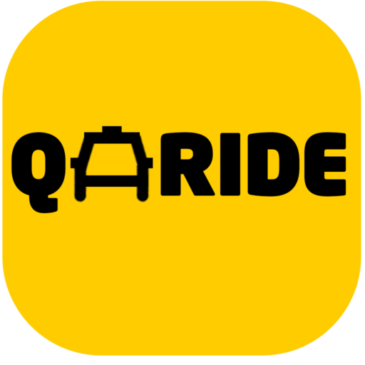
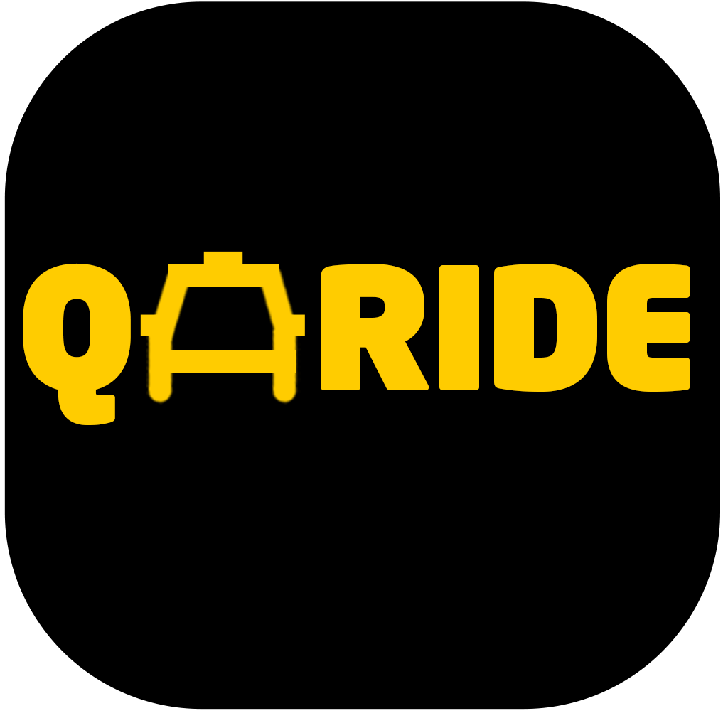
- The primary logo should be used in most cases, especially for official branding and marketing materials.
- The secondary logo can be used for specific applications, such as rider apps or vehicle branding.
- The logo should always be used in its original form and should not be altered, modified, or combined with other elements.
- The logo should be placed on a plain background with sufficient space around it.
Colors
- Primary color: #ffcc00 (yellow)
- Secondary color: Black
Typography
- Font Family: Neo Sans
- font: Neo Sans Arabic
Brand Applications
- Website: The Qaride logo should be prominently displayed on the homepage and throughout the website.
- Mobile app: The Qaride logo should be used as the app icon and in the app’s interface.
- Social media: The Qaride logo should be used in profile pictures, cover photos, and posts.
- Marketing materials: The Qaride logo should be prominently featured on all marketing materials, such as brochures, flyers, and advertisements.
- Vehicle branding: The Qaride logo should be applied to vehicles in a consistent and professional manner.
Additional Guidelines
- Image quality: Ensure that all images used in association with the Qaride brand are of high quality.
- Consistency: Maintain consistency in the use of the Qaride brand across all platforms.
- Permission: Always obtain permission before using the Qaride brand in any unauthorized applications.
By following these guidelines, you can help to strengthen the Qaride brand and ensure a consistent and professional image.
